

In 2024, Nigeria’s naira lost 43% of its value against the dollar. Argentina’s peso lost 55%. Ghana’s cedi, 22%. Living in high-inflation economies, these people figured out how to protect their savings: they hold dollars informally, through exchanges, transfers, and workarounds their governments didn’t design for them. Cashi was built to formalise what they were already doing. Our design challenge was not explaining a new technology. It was making that technology completely invisible.
Problem Context
Across high-inflation markets, from Latin America to Sub-Saharan Africa to Southeast Asia; populations have developed a deeply ingrained relationship with the US dollar. Not as a foreign currency, but to preserve wealth.
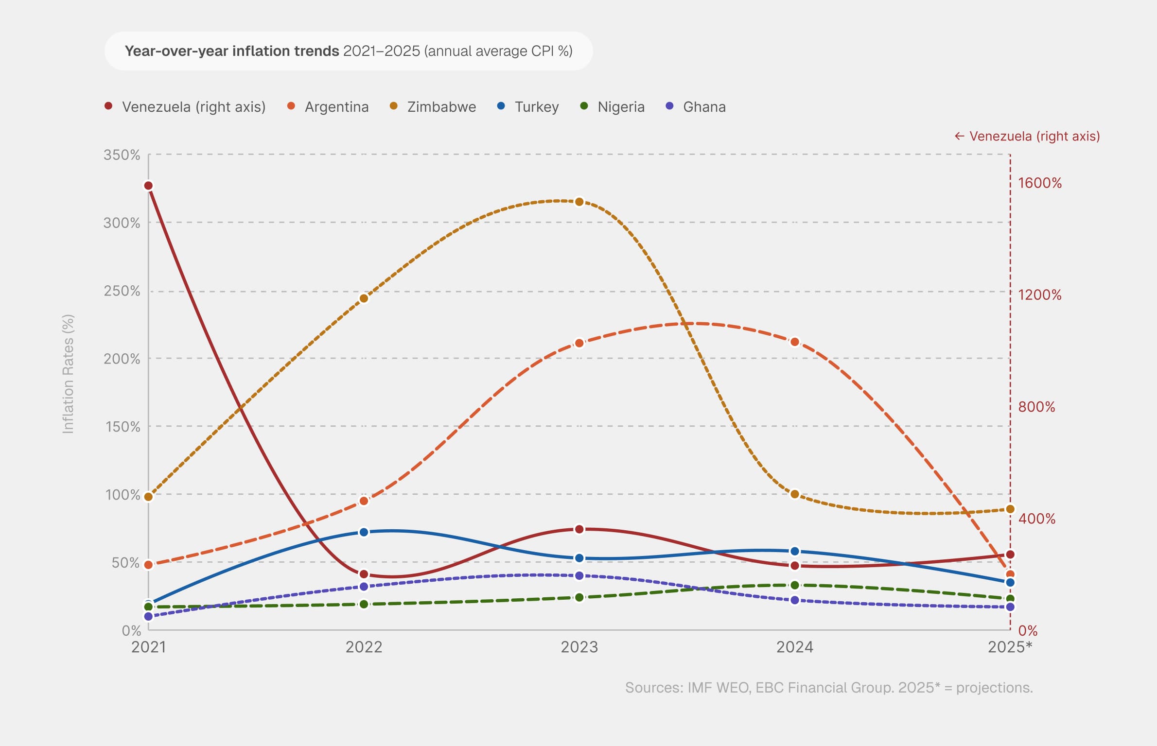
The informal infrastructure to serve this need already existed, but it came with friction. You could hold dollars informally, but you couldn’t use them. You couldn’t tap a card at a local merchant, pay for a subscription, or shop online with savings that lived outside the formal banking system.
Why This Had to Be Built on Crypto
Getting access to dollars through traditional banking often requires a US bank account. For the populations Cashi was built for, none of those conditions apply.
Crypto infrastructure removes those prerequisites. A stablecoin like USDT is pegged to the dollar and it holds its value without the holder needing a US bank account. It moves across borders without correspondent banking, SWIFT delays, or minimum balance requirements.
The Right Tool, Presented the Wrong Way
The product was technically a stablecoin wallet with a Visa card on top. But that was never the right way to think about what we were building for users.
To understand the issue better, we interview people from Spain, Nigeria, Brazil, and Portugese. We also used AI-assisted social listening to scan public Telegram groups and X conversations where people were discussing financial, stablecoins, inflation, remittance, and local payment workarounds. The goal was to find what people complained about, what confused them, and where trust broke down.
These are what we found :
-
Users wanted dollars, not crypto. When we described the product using crypto terminology, comprehension dropped sharply. They immediately understand when we described it as “a dollar account with a Visa card”.
-
Crypto language created the wrong associations. “Crypto” carried associations with speculation, volatility, and risk — the opposite of why users wanted the product.
-
Safety and control were the precondition for putting money in at all. Trust wasn’t a feature, but the bar they had to clear before depositing a single dollar.
-
Make unavoidable crypto flows, unnecessary for most users. Sending to a wallet address is a legitimate use case we couldn’t abstract away entirely, but for the majority of users, these are non-existent.
Key Design Decisions
Card product, not crypto
The most important structural decision we made was treating the Visa card, and not the crypto wallet as the primary UI element. On the home screen, the orange Cashi Visa card is the largest element on screen at every state. The two primary actions are “Deposit” and “Send.” Nothing on the primary surface suggests crypto infrastructure exists underneath it.

Building ownership before commitment. Introducing the card at the very beginning of onboarding hooks users emotionally, transforming compliance steps like KYC into progression milestones.
Fast, frictionless and rewarding onboarding
The emotional hook of Cashi is the card. So we introduced it at the very start of onboarding, and not as a reward at the end of the funnel. This creates ownership before commitment, and attachment to something that they want to unlock. The KYC prompt, the deposit nudge, the card activation step all become progress, not requirements they have to satisfy.
Not only that, the account creation highlights on security actions only, ensuring that user’s account is safe from day one.
Speak the user’s financial language
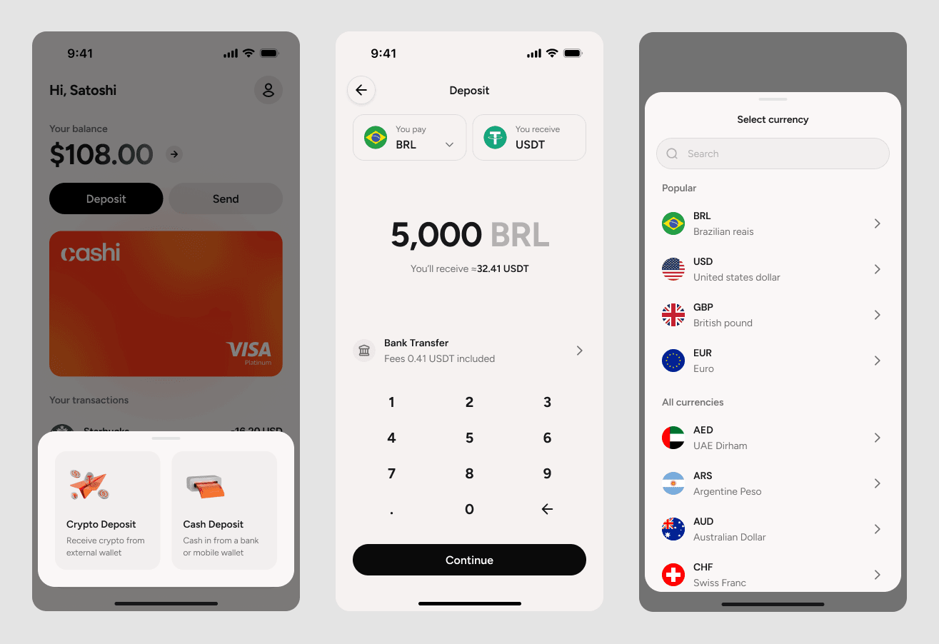
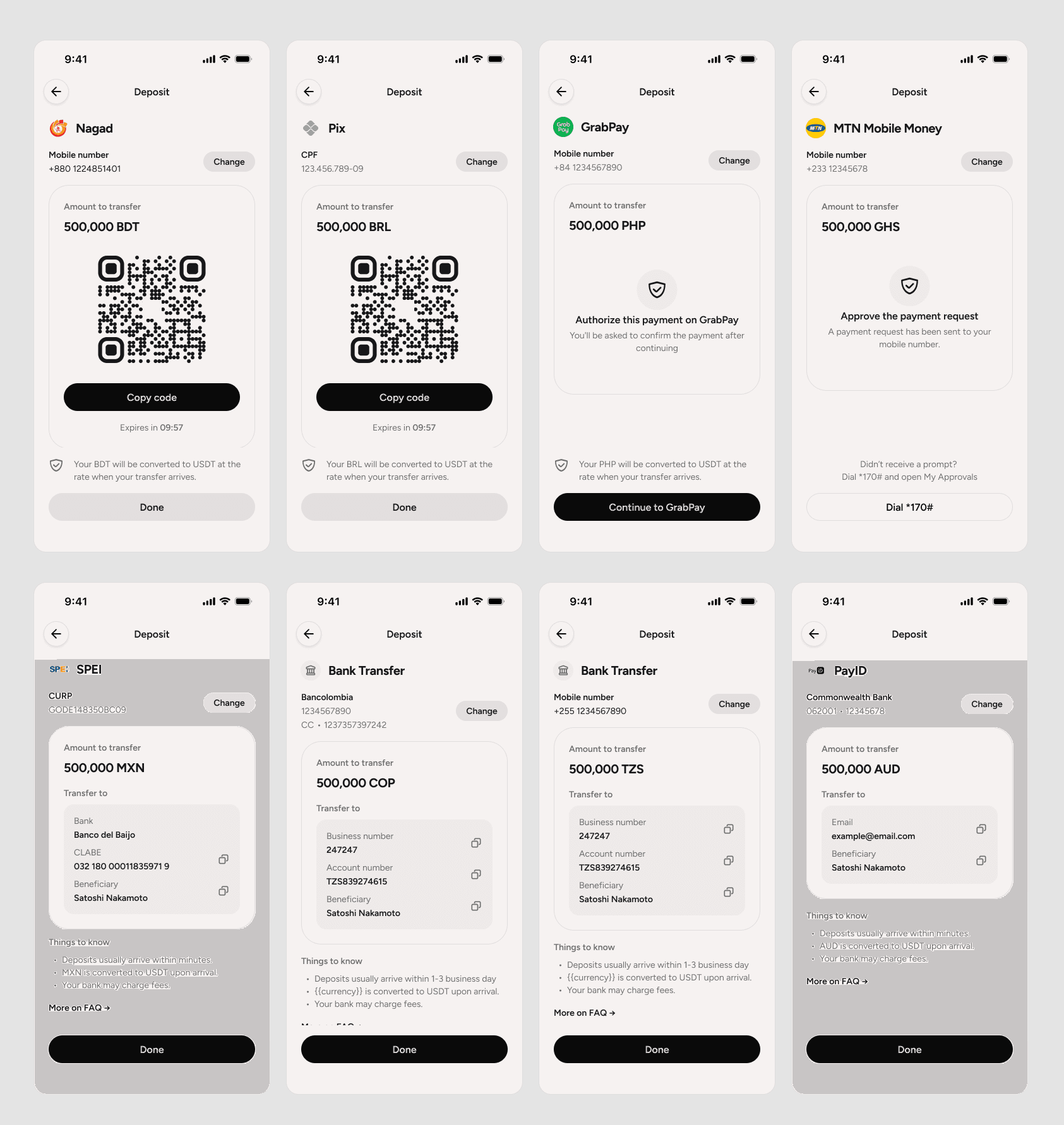
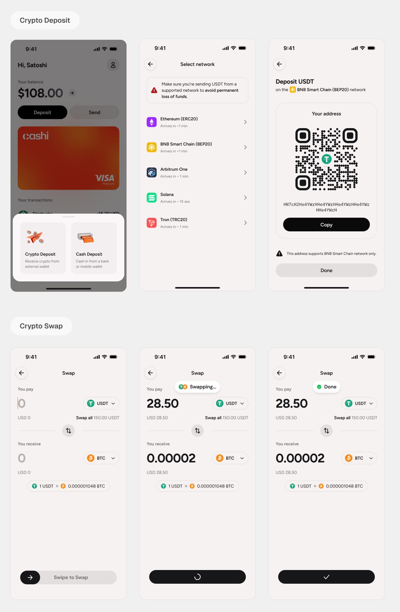
The fastest way to lose someone in a financial product is to ask them to learn a new way to move their own money. So rather than impose one global flow, we built deposit and withdrawal around the methods people already trust in their own country. Every user sees their local currency and familiar flows.
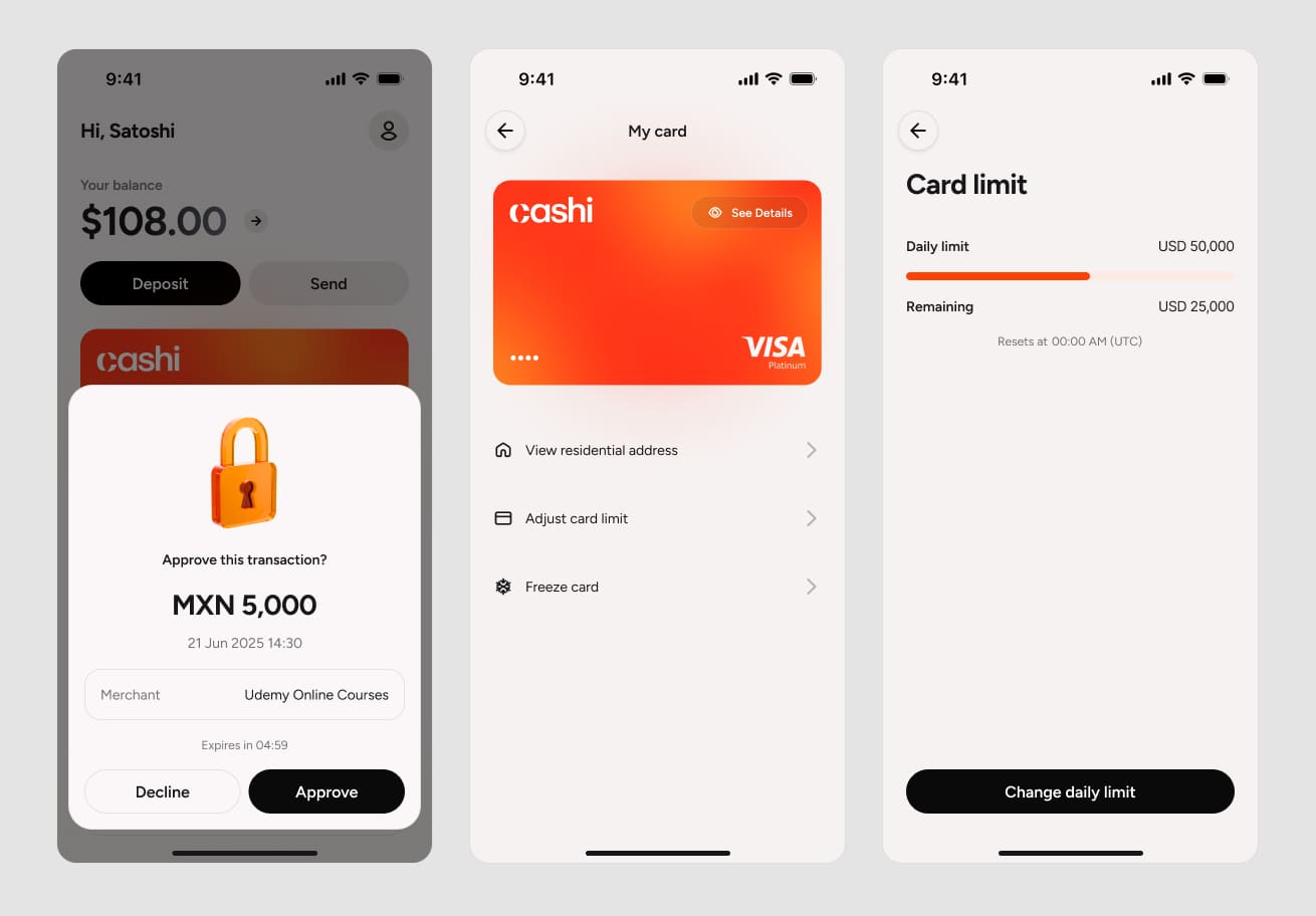
Security that feels like control
In a financial product, security and trust sit at the top of every user’s priority list. They decide whether to put real money into a product based on whether it feels safe.
Make crypto accessible — never obligatory
The entire product rests on a single IA principle: crypto should be reachable for users who want it, and invisible for users who don’t.
The result is a product that crypto-native users recognise as familiar, and that everyone else experiences as a straightforward dollar account. Neither group has to compromise.
Reward as the growth engine
Most products bolt rewards onto an existing experience as an afterthought. We designed it as the opposite: a dedicated reward page sitting in the main navigation, treating it as our primary marketing and retention channel from day one.
Converting reward balance into spendable credit is the most delightful and rewarding moment, not a utility step.
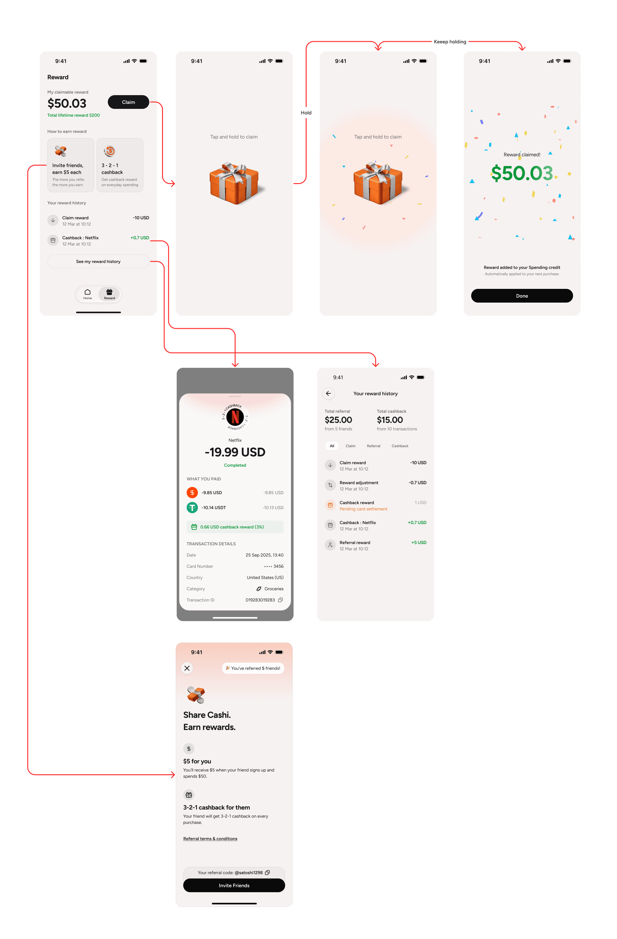
Centralized reward — reward redemption designed as a celebration, reinforcing that real money just landed in the account.
Result
As Cashi approaches public launch, we have established a clear UX and business measurement framework to evaluate the efficacy of this approach.
-
Activation Rate: Monitoring the percentage of signups who complete KYC and successfully fund their account, validating whether the “card-first” onboarding effectively drives user commitment.
-
Time-to-First-Transaction: Measuring the days between account creation and the first Visa card swipe, testing if our rewards engine successfully translates into real-world utility.
-
Retention: Tracking long-term stickiness to see how consistently users hold balances and using the card for daily local transactions.
Our core qualitative benchmark remains trust. In a market where institutional confidence has been systematically compromised, the ultimate measure of our design’s success will be users consistently reporting that Cashi “just feels like a normal bank account.”